
Design Agencies
- Dec 15, 2017
- 2 min read
A design agency, (also know as an advertising agency), is a business that focuses on creating, planning, and handling advertising, and other forms of promotion. They continuously work on creating new advertising strategies, to allow people to have a broad range of techniques to help promote a product. I have found a few different agencies that specialise in branding and packaging.
The first agency is called Slice Design, who started out in 2004, and have been designing packaging for many different companies since. These companies include Activia, where they made a design for the seasonal edition of the yogurts, and Extra, where they designed a new version of the chewing gum packaging to make it more modern. I think the designs are good because they have kept the old look, meaning that it is still recognisable, but they have still updated, making it look like a whole new product.


The second business is called Flip Flop Design, who have a website that showcases many of their great creations. They focus on packaging and designs, and also web design. One of their designs was for Bullingberg, who wanted a simple yet effective design, that was quite cheap to create, but didn't look cheap. They kept the main colour on the packaging black, but included different colours at the bottom for the various versions of the product, which allows the colour to be recognisable to the customer, as the use of black mixed well with all of the other colours involved. I like their designs as the concept is basic, yet the outcome allows the product to become bold, which makes it stand out. Their website is https://www.flipflopdesign.co.uk/.

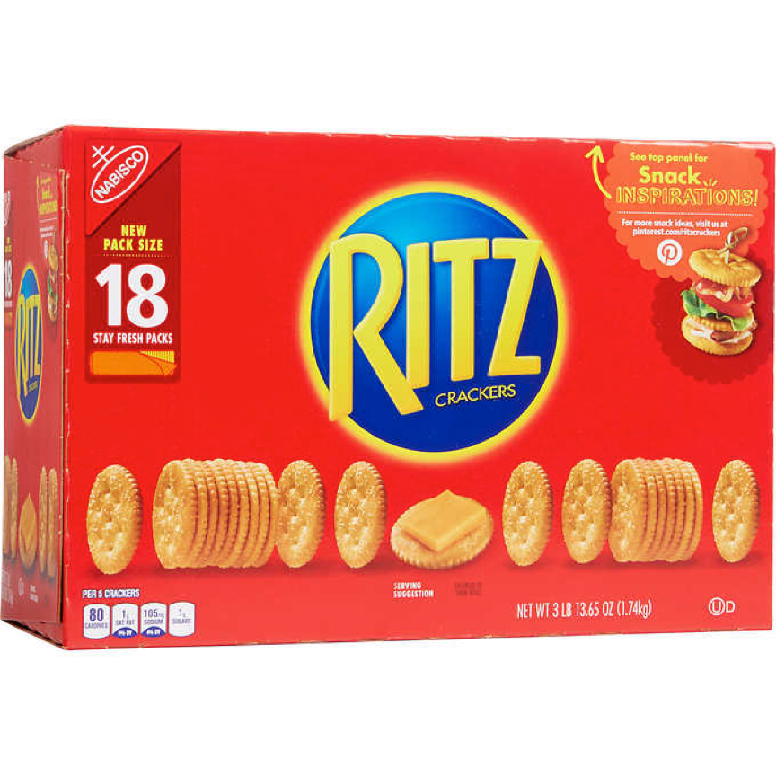
The third agency is Bulletproof, who are based in London. They have taken on many different designs, including the Ritz packaging, which made them improve the design by modernising it. Many designs for the crackers have been around for a while, but each time they have lost their originality, until Bulletproof designs brought back their look, and chose the colours that stand out. These colours allow them to have a brand thats recognisable, meaning because they are well known, people will automatically know what brand it is. I think this is a good design because they have kept the design scheme simple, with only 3 different colours that are used, making it easy to recognise, which is what the company wanted to bring back.


Comments