
Primary Research
- Feb 3, 2018
- 2 min read
For my primary research I collected 4 different leaflets from my local train station and looked into what colours they used for the type of look each leaflet wanted to give off, and the more darker ones helped me more with farmaggedon as they showed me what colours should be used to give off a creepier look.

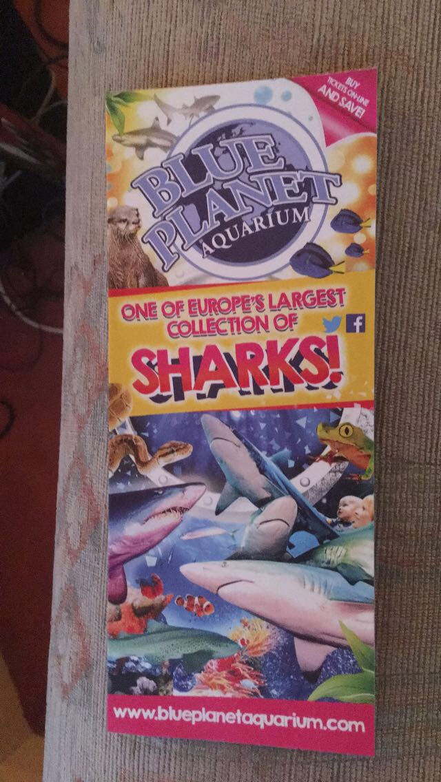
This is the first leaflet I looked at, and this is for a theme park. This shows how bright colours contrasting each other can help bring out a picture, which catches your attention, and this would be good for the postcard and badge for contagion, because this house also uses these colours to stand out and distract you from what terror is about to jump out at you around the corner. I think this is a good design as it gives you a picture of what you can expect to see there, however, to make it even more intriguing, they could have added more than one picture, as there is so much to do t the theme park, so they still wouldn't be revealing too much about it.
This leaflet uses dark tones to allow it to look creepy and mysterious, which is exactly what farmaggedon

needs. The use of the dark colours has helped me for my work as this shows that these are the colours I need to use to make people get creeped out from just looking at the picture. They have also centred the window in the middle of the picture, making you focus on this area, which could also be useful for my project as I could use this to yet again distract people from the surroundings, so something could be hidden there, which would again make it more creepy. I like this leaflet as it gives you a little idea of what you can expect to see, but it doesn't show off everything, so you don't know everything of what you will see.
This leaflet again has many different colours on it t help it stand out, but it also has lots of pictures that cover the page up, meaning that so much is going on on the page, that there are places where there can be secret messages hidden, and this could be good for my postcards as it gives you something else to look for other than just the pictures. I like this design because even though there are lots of images on the page, it doesn't look crowded, which means that it keeps the professional look to it.

This leaflet is the best leaflet out of all the leaflets I have looked at to collect inspiration for farmaggedon from, as the colours are representing the "wicked" aspect of the show that they are advertising, which will also be looked at for farmaggedon. The dark greens and blacks are great colours to help the image look "spookier", and for things like Terror on the Farm, these colours will match well, as I will be using plants like corn in the background. I like this leaflet as its simple, yet bold, as it only uses the three colours green, white, and black.


Comments